Pantone Matching System (PMS) colors play a crucial role in ensuring color consistency and accuracy in print and digital media. Whether for packaging, branding, or graphic design, PMS colors provide a standardized way of achieving precise color reproduction. In this article, we will explore the fundamentals of the Pantone Matching System, its significance in the creative industries, and how it impacts your product packaging and brand identity.
What is the Pantone Matching System (PMS)?
The Pantone Matching System (PMS) is a standardized color reproduction system widely used in printing, graphic design, and branding. It was developed to provide an accurate and consistent color reference, ensuring that colors remain consistent across various platforms, including digital designs, print media, and physical products. PMS colors are identified by unique codes, making it easy to match specific colors across different materials, substrates, and printers.
Using PMS colors ensures that your brand’s visual identity remains consistent and recognizable. This system is especially important in packaging, where color accuracy can directly affect how a product is perceived by consumers.
Why is PMS Color Important for Branding and Packaging?
- Consistency Across Platforms: Pantone colors provide uniformity and reliability, ensuring that your brand’s color palette is maintained across all marketing materials, whether it’s printed materials, packaging, or digital formats. This consistency strengthens brand recognition and trust.
- Color Accuracy: PMS colors are created by mixing specific amounts of primary colors, which ensures a more accurate reproduction of colors compared to other color systems. This precision is particularly valuable when producing custom packaging or branded products.
- Impact on Consumer Perception: Color is a key element in consumer decision-making. The right PMS color can evoke specific emotions and reactions, helping your product stand out on store shelves. The consistency of PMS ensures that your product looks as intended, whether in retail or online.
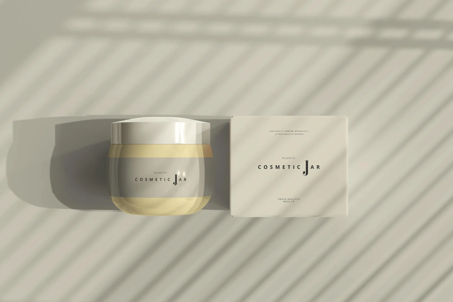
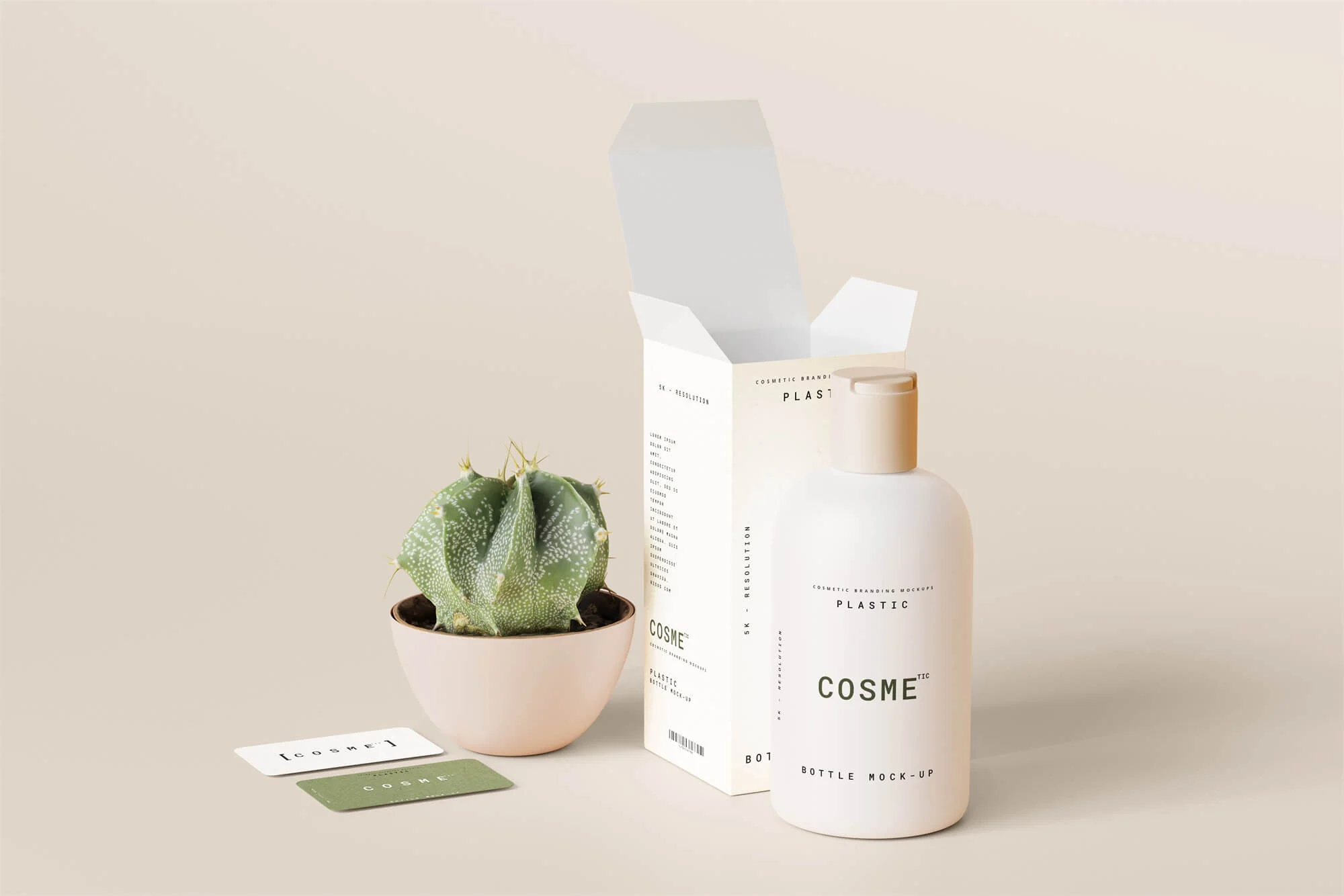
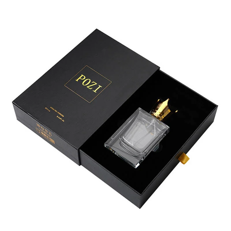
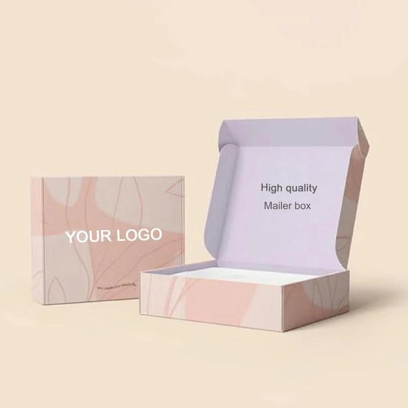
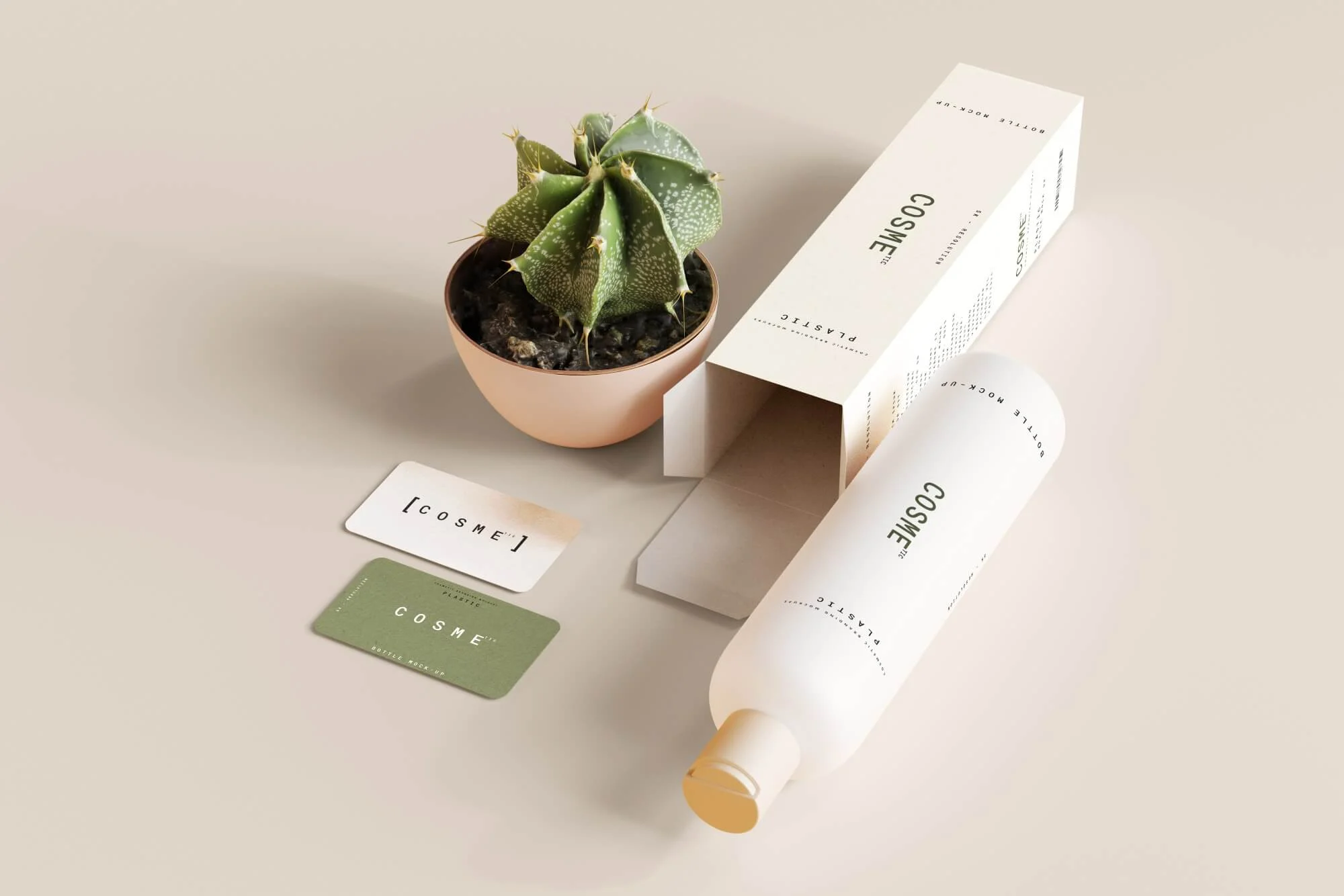
- Custom Packaging Solutions: PMS colors are essential when designing custom packaging. Whether you’re producing folding cartons, corrugated boxes, or luxury packaging, Pantone color matching ensures that every element of the packaging design aligns perfectly with your brand’s aesthetic.
How Does PMS Work?
The Pantone Matching System uses a set of color codes to identify specific shades. Each Pantone color has a corresponding numerical code (e.g., Pantone 186 C), which can be referenced by designers, printers, and manufacturers to ensure the exact color is used. PMS colors are mixed using a combination of primary pigments, which are standardized for consistency.
The process of color mixing in PMS ensures that the printed colors match the desired shade perfectly, whether on paper, plastic, or fabric. PMS colors are typically used in spot color printing, which allows for high-quality, precise color matching that is crucial for brand identity.
PMS vs. CMYK: Understanding the Difference
While PMS is a spot color system, CMYK (Cyan, Magenta, Yellow, and Black) is a four-color process used in standard printing. The main difference between these two systems lies in how the colors are created:
- PMS Colors: These are pre-mixed colors, meaning each color is created from a specific ink formula and applied as a single, solid color. This method ensures the color is uniform and highly accurate, making it ideal for branding and packaging.
- CMYK Colors: These are created by combining different percentages of cyan, magenta, yellow, and black inks. While this method allows for a wide range of color possibilities, it is often less precise than PMS, especially when it comes to achieving consistent color across multiple materials.
For businesses seeking exact color replication, PMS offers more precision and reliability, making it the preferred choice for packaging and branding projects.
Applications of PMS in Packaging and Branding
- Packaging Design: Custom packaging, such as folding cartons or corrugated boxes, often requires precise color matching to ensure the packaging reflects the brand’s identity. Pantone colors are used to ensure the colors on the packaging align with the company’s branding guidelines and look exactly as intended.
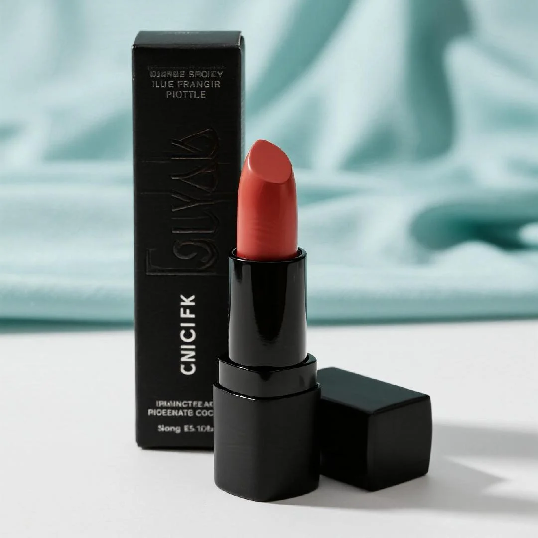
- Logos and Brand Identity: Logos are one of the most critical elements of a brand’s identity, and PMS colors ensure that your logo’s colors are consistently reproduced across all media. Whether it’s on print materials, websites, or product packaging, Pantone colors help maintain brand cohesion.
- Retail Display and Marketing Materials: PMS colors also extend to other branding elements, such as retail displays, flyers, and brochures. Ensuring color accuracy across all marketing materials helps establish a strong visual identity, making your brand more recognizable to consumers.
How to Choose the Right PMS Color for Your Brand
Choosing the right PMS color is an important step in developing your brand’s visual identity. Here are some tips:
- Consider the Psychology of Color: Colors evoke emotional responses, so choose a PMS color that aligns with the emotions you want to convey. For example, blue may communicate trust and professionalism, while red can evoke excitement or urgency.
- Match the Brand Personality: Your color choice should reflect your brand’s personality and values. If your brand is eco-conscious, you might opt for natural greens and earth tones, while a luxury brand might use gold or deep, rich colors.
- Test Across Materials: Before finalizing your PMS color, it’s essential to test how it looks across different materials and printing techniques. A color may appear slightly different on a printed brochure than it does on a product package.
Conclusion
The Pantone Matching System (PMS) is an indispensable tool for businesses looking to maintain color consistency and achieve high-quality branding. Whether you’re designing custom packaging or developing marketing materials, PMS ensures that your colors remain accurate and recognizable across all media. By understanding how to use PMS colors effectively, you can create a cohesive brand identity that resonates with consumers and stands out in the competitive market.
If you’re ready to start using PMS colors in your custom packaging, contact our team to discuss how we can help you choose the right Pantone shades for your product packaging and brand design.
Pantone Matching System (PMS) colors play a crucial role in ensuring color consistency and accuracy in print and digital media. Whether for packaging, branding, or graphic design, PMS colors provide a standardized way of achieving precise color reproduction. In this article, we will explore the fundamentals of the Pantone Matching System, its significance in the creative industries, and how it impacts your product packaging and brand identity.
What is the Pantone Matching System (PMS)?
The Pantone Matching System (PMS) is a standardized color reproduction system widely used in printing, graphic design, and branding. It was developed to provide an accurate and consistent color reference, ensuring that colors remain consistent across various platforms, including digital designs, print media, and physical products. PMS colors are identified by unique codes, making it easy to match specific colors across different materials, substrates, and printers.
Using PMS colors ensures that your brand’s visual identity remains consistent and recognizable. This system is especially important in packaging, where color accuracy can directly affect how a product is perceived by consumers.
Why is PMS Color Important for Branding and Packaging?
- Consistency Across Platforms: Pantone colors provide uniformity and reliability, ensuring that your brand’s color palette is maintained across all marketing materials, whether it’s printed materials, packaging, or digital formats. This consistency strengthens brand recognition and trust.
- Color Accuracy: PMS colors are created by mixing specific amounts of primary colors, which ensures a more accurate reproduction of colors compared to other color systems. This precision is particularly valuable when producing custom packaging or branded products.
- Impact on Consumer Perception: Color is a key element in consumer decision-making. The right PMS color can evoke specific emotions and reactions, helping your product stand out on store shelves. The consistency of PMS ensures that your product looks as intended, whether in retail or online.
- Custom Packaging Solutions: PMS colors are essential when designing custom packaging. Whether you’re producing folding cartons, corrugated boxes, or luxury packaging, Pantone color matching ensures that every element of the packaging design aligns perfectly with your brand’s aesthetic.
How Does PMS Work?
The Pantone Matching System uses a set of color codes to identify specific shades. Each Pantone color has a corresponding numerical code (e.g., Pantone 186 C), which can be referenced by designers, printers, and manufacturers to ensure the exact color is used. PMS colors are mixed using a combination of primary pigments, which are standardized for consistency.
The process of color mixing in PMS ensures that the printed colors match the desired shade perfectly, whether on paper, plastic, or fabric. PMS colors are typically used in spot color printing, which allows for high-quality, precise color matching that is crucial for brand identity.
PMS vs. CMYK: Understanding the Difference
While PMS is a spot color system, CMYK (Cyan, Magenta, Yellow, and Black) is a four-color process used in standard printing. The main difference between these two systems lies in how the colors are created:
- PMS Colors: These are pre-mixed colors, meaning each color is created from a specific ink formula and applied as a single, solid color. This method ensures the color is uniform and highly accurate, making it ideal for branding and packaging.
- CMYK Colors: These are created by combining different percentages of cyan, magenta, yellow, and black inks. While this method allows for a wide range of color possibilities, it is often less precise than PMS, especially when it comes to achieving consistent color across multiple materials.
For businesses seeking exact color replication, PMS offers more precision and reliability, making it the preferred choice for packaging and branding projects.
Applications of PMS in Packaging and Branding
- Packaging Design: Custom packaging, such as folding cartons or corrugated boxes, often requires precise color matching to ensure the packaging reflects the brand’s identity. Pantone colors are used to ensure the colors on the packaging align with the company’s branding guidelines and look exactly as intended.
- Logos and Brand Identity: Logos are one of the most critical elements of a brand’s identity, and PMS colors ensure that your logo’s colors are consistently reproduced across all media. Whether it’s on print materials, websites, or product packaging, Pantone colors help maintain brand cohesion.
- Retail Display and Marketing Materials: PMS colors also extend to other branding elements, such as retail displays, flyers, and brochures. Ensuring color accuracy across all marketing materials helps establish a strong visual identity, making your brand more recognizable to consumers.
How to Choose the Right PMS Color for Your Brand
Choosing the right PMS color is an important step in developing your brand’s visual identity. Here are some tips:
- Consider the Psychology of Color: Colors evoke emotional responses, so choose a PMS color that aligns with the emotions you want to convey. For example, blue may communicate trust and professionalism, while red can evoke excitement or urgency.
- Match the Brand Personality: Your color choice should reflect your brand’s personality and values. If your brand is eco-conscious, you might opt for natural greens and earth tones, while a luxury brand might use gold or deep, rich colors.
- Test Across Materials: Before finalizing your PMS color, it’s essential to test how it looks across different materials and printing techniques. A color may appear slightly different on a printed brochure than it does on a product package.
Conclusion
The Pantone Matching System (PMS) is an indispensable tool for businesses looking to maintain color consistency and achieve high-quality branding. Whether you’re designing custom packaging or developing marketing materials, PMS ensures that your colors remain accurate and recognizable across all media. By understanding how to use PMS colors effectively, you can create a cohesive brand identity that resonates with consumers and stands out in the competitive market.
If you’re ready to start using PMS colors in your custom packaging, contact our team to discuss how we can help you choose the right Pantone shades for your product packaging and brand design.